Featured image of post Consistent Spacing – Improve your Flutter App with this Package

Consistent Spacing – Improve your Flutter App with this Package

In this tutorial I show you how to quickly improve the quality of your app by applying consistent spacings to your UI.

Consistency is a key factor in a good, usable application. Having inconsistent spacing in your app, is unpleasant for the user’s eyes. They might not be able to put the finger on it, but they will feel that there’s something not right.

And it’s not even difficult to be consistent. This tutorial shows you how to define consistent spacings in your Flutter app and how to use spacing_generator to generate simple-to-access SizedBox and EdgeInsets instances.

The source code for this tutorial can be found on GitHub: https://github.com/bettercoding-dev/spacing-generator.

How not to do spacings

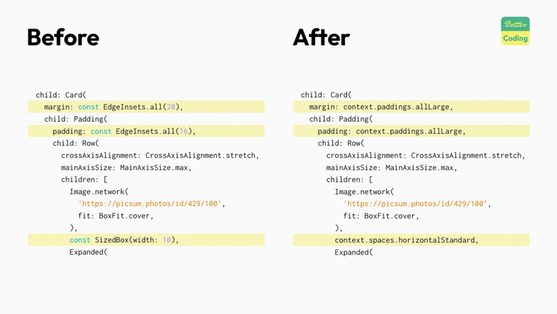
Let’s look at this bad example. In this code we hard-code the spaces in the UI, which over time leads to inconsistencies. Especially, when working on larger projects, with multiple developers, it’s difficult to maintain consistent spacings this way.

Sooner or later one will forget that you agreed on using 16 pixels as your preferred spacing for cards and uses 20 pixels instead.

 1
 2
 3
 4
 5
 6
 7
 8
 9
10
11
12
13
14
15
16
17
18
19
20
21
22
23
24
25
26
27
28
29
30
31
32
33
34
35
36
37
38
39
40
41
42
43
44
45
46
47
48
49
50
51
52
53
54
55
56
57
58
59
60
61
62
63
64
65
66
import 'package:flutter/material.dart';

class BadCard extends StatelessWidget {
  const BadCard({super.key});

  @override
  Widget build(BuildContext context) {
    return SizedBox(
      height: 200,
      child: Card(
        margin: const EdgeInsets.all(20),
        child: Padding(
          padding: const EdgeInsets.all(16),
          child: Row(
            crossAxisAlignment: CrossAxisAlignment.stretch,
            mainAxisSize: MainAxisSize.max,
            children: [
              Image.network(
                'https://picsum.photos/id/429/100',
                fit: BoxFit.cover,
              ),
              const SizedBox(width: 10),
              Expanded(
                child: Column(
                  crossAxisAlignment: CrossAxisAlignment.stretch,
                  children: [
                    Text(
                      'My favorite restaurant',
                      style: Theme
                          .of(context)
                          .textTheme
                          .titleMedium,
                    ),
                    const SizedBox(height: 4),
                    Text(
                      'Come here and try',
                      style: Theme
                          .of(context)
                          .textTheme
                          .bodyMedium,
                    ),
                    const Spacer(),
                    Row(
                      mainAxisAlignment: MainAxisAlignment.end,
                      children: [
                        TextButton(
                          onPressed: () {},
                          child: const Text('Details'),
                        ),
                        const SizedBox(width: 6),
                        ElevatedButton(
                          onPressed: () {},
                          child: const Text('Visit'),
                        ),
                      ],
                    )
                  ],
                ),
              )
            ],
          ),
        ),
      ),
    );
  }
}

Also, what happens if your design team suddenly decides to now use 8 instead of 10 pixel spacings? Let’s find a better solution for this.

Set up

To use the spacing_generator package, we need to add it to our app.

If you have the Flutter Version Manager installed use this command (recommended). This ensures you’re using the same version as this tutorial.

fvm flutter pub add spacing_generator_annotation dev:spacing_generator dev:build_runner

Otherwise, simply call:

flutter pub add spacing_generator_annotation dev:spacing_generator dev:build_runner

Afterward, your dependencies should look like this:

dependencies:
  flutter:
    sdk: flutter
  spacing_generator_annotation: ^0.3.0

dev_dependencies:
  flutter_test:
    sdk: flutter
  flutter_lints: ^4.0.0
  spacing_generator: ^0.4.0+5
  build_runner: ^2.4.12

Define the spaces

Next, let’s create a file spaces.dart, where we will define a set of spaces that we want to use throughout the app.

 1
 2
 3
 4
 5
 6
 7
 8
 9
10
11
import 'package:spacing_generator_annotation/spacing_generator_annotation.dart';
import 'package:flutter/material.dart';

part 'spaces.g.dart';

@Spacing()
class SpaceDefinitions {
  static const small = 4.0;
  static const standard = 8.0;
  static const large = 16.0;
}

Notice the @Spacing() annotation. It tells the spacing_generator package to take the values defined in this class and generate EdgeInset and SizedBox instances for them.

Now, let’s start the build_runner to generate the code. Again you can skip the fvm command.

fvm dart run build_runner build

Apply the generated spacings

Finally, let us apply the generated spacings to the example widget we saw before.

 1
 2
 3
 4
 5
 6
 7
 8
 9
10
11
12
13
14
15
16
17
18
19
20
21
22
23
24
25
26
27
28
29
30
31
32
33
34
35
36
37
38
39
40
41
42
43
44
45
46
47
48
49
50
51
52
53
54
55
56
57
58
59
60
61
62
63
64
65
66
67
import 'package:flutter/material.dart';
import 'package:spacing_generator_tutorial/spaces.dart';

class GoodCard extends StatelessWidget {
  const GoodCard({super.key});

  @override
  Widget build(BuildContext context) {
    return SizedBox(
      height: 200,
      child: Card(
        margin: context.paddings.allLarge,
        child: Padding(
          padding: context.paddings.allLarge,
          child: Row(
            crossAxisAlignment: CrossAxisAlignment.stretch,
            mainAxisSize: MainAxisSize.max,
            children: [
              Image.network(
                'https://picsum.photos/id/429/100',
                fit: BoxFit.cover,
              ),
              context.spaces.horizontalStandard,
              Expanded(
                child: Column(
                  crossAxisAlignment: CrossAxisAlignment.stretch,
                  children: [
                    Text(
                      'Good Card',
                      style: Theme
                          .of(context)
                          .textTheme
                          .titleMedium,
                    ),
                    context.spaces.verticalSmall,
                    Text(
                      'We use consistent spacings here.',
                      style: Theme
                          .of(context)
                          .textTheme
                          .bodyMedium,
                    ),
                    const Spacer(),
                    Row(
                      mainAxisAlignment: MainAxisAlignment.end,
                      children: [
                        TextButton(
                          onPressed: () {},
                          child: const Text('Details'),
                        ),
                        context.spaces.horizontalSmall,
                        ElevatedButton(
                          onPressed: () {},
                          child: const Text('Visit'),
                        ),
                      ],
                    )
                  ],
                ),
              )
            ],
          ),
        ),
      ),
    );
  }
}

Now, instead of using hard-coded values, we reference our generated spaces. This way, we don’t need to worry about the actual pixel value, but rather only need to remember the name.

If you plan to change the spacings in the future, simple update the values in SpaceDefinitions, regenerate the code and all spacings in your app update automatically as well.

Take away

Although being consistent is one of the key-principals of UX, it’s often ignored during development. This is unfortunate, since using consistent spacings isn’t difficult at all. With packages like spacing_generator it is really simple to define a set of consistent spacings and reuse them throughout your app. It might look like a small think, but it instantly improves the perceived quality of your app.
Built with Hugo
Theme based on Stack designed by Jimmy