Adding a dark and a light mode is becoming increasingly popular in app development. In this tutorial, we will
write a Flutter app with a light and a dark theme and extend Flutter’s ThemeData with custom attributes.
Goal of this Tutorial
In this tutorial, we will have a look at how to add a dark and a light theme to your Flutter project. Further, we will implement the functionality to switch between dark and light mode directly within your app.
Since often it is necessary to have custom, theme-specific attributes, we will have a look on how to solve this problem. This tutorial also shows how to load theme-specific assets.
You can check out the code for this tutorial on GitHub. Use
the template branch as a starting point, or create your own project. The finished app is on branch solution.
Prerequisites
Before we start, we need to create a new Flutter project. We will be using a Flutter version supporting null-safety for this tutorial.
Furthermore, we need to add flutter_riverpod as dependency.
Lastly, we need to create an asset folder right in your root directory and reference it in our pubspec.yaml file.
This allows us to load images from this directory later.
The pubspec.yaml should look like this:
| |
Dark and Light Theme: Specifying the look
Next, we create a theme.dart file in our lib folder. This file will contain the heart of our app. Here we will
specify our ThemeDatas and create some utility classes and functions.
Let’s start with defining our themes.
| |
Here you can be creative how you want to style the app. This is how I defined my _theme and _darkTheme. Just make
sure you set the brightness of your ThemeData correctly, so that the correct fallback values can be used.
| |
Custom Attributes: Extending ThemeData
Often, you want to have additional theme-specific attributes, but extending ThemeData does not really work well (
if at all). For this tutorial, we are going to assume that we want to size our images differently on light and on dark
mode.
To solve this problem, we create a new class CustomThemeData right under // EXTENSIONS AND CLASSES and add an
imageSize attribute.
The class should look like this:
| |
A size of 100 is used as the default value. Add any attributes to this class that you need in your app.
Now we create instances of CustomThemeData for both, light and dark theme and put them right below their corresponding
ThemeData instances.
| |
In this case, images will have a size of 150 in the light theme, whereas the dark theme will fall back on the default value of 100.
To glue it all together, we create an extension that makes our CustomThemeData available to use.
| |
Now, our custom theme attributes can be accessed using:
| |
Amazing, right?
Providing our themes using Riverpod
After creating the style of our themes, we need to provide them to our MaterialApp widget. We are going to use *
Riverpod* for this purpose. If you are not familiar with Riverpod checkout riverpod.dev.
We create following two providers below // THEME PROVIDERS:
| |
Next, we continue in the main.dart file. A very basic implementation could look like this:
| |
First, we need to define a ProviderScope. This is required by Riverpod to work. Afterwards, our main function is
defined this way:
| |
So far, the app won’t do much. Let’s replace the Container with something more useful.
| |
We need to wrap our MaterialApp with a Consumer widget from the Riverpod package. Consumer offers us the watch
function that we will use to read (‘watch’) the values offered by our Providers.
By default, Flutter uses the brightness (light or dark mode) from the underlying system. For now, we leave it like this, but we will return later to implement switching themes within the app ( see: Theme Switching: changing the Theme within the App).
Finally, it is time to create a page that we want to show when the app starts. We create a file main_page.dart and add
a StatelessWidget MainPage.
Feel free to be creative here. I’ll go with the following code:
| |
Don’t forget to replace the Container with MainPage at the home attribute of your MaterialApp.
Now, let’s build our app.
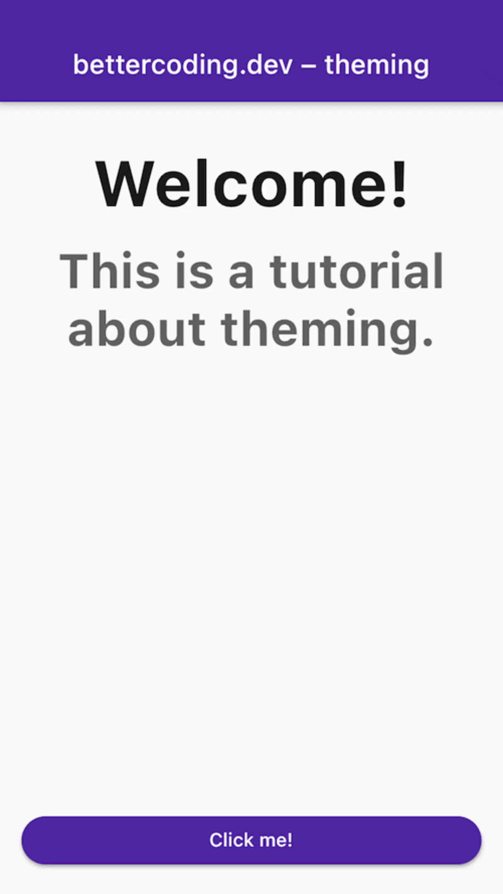
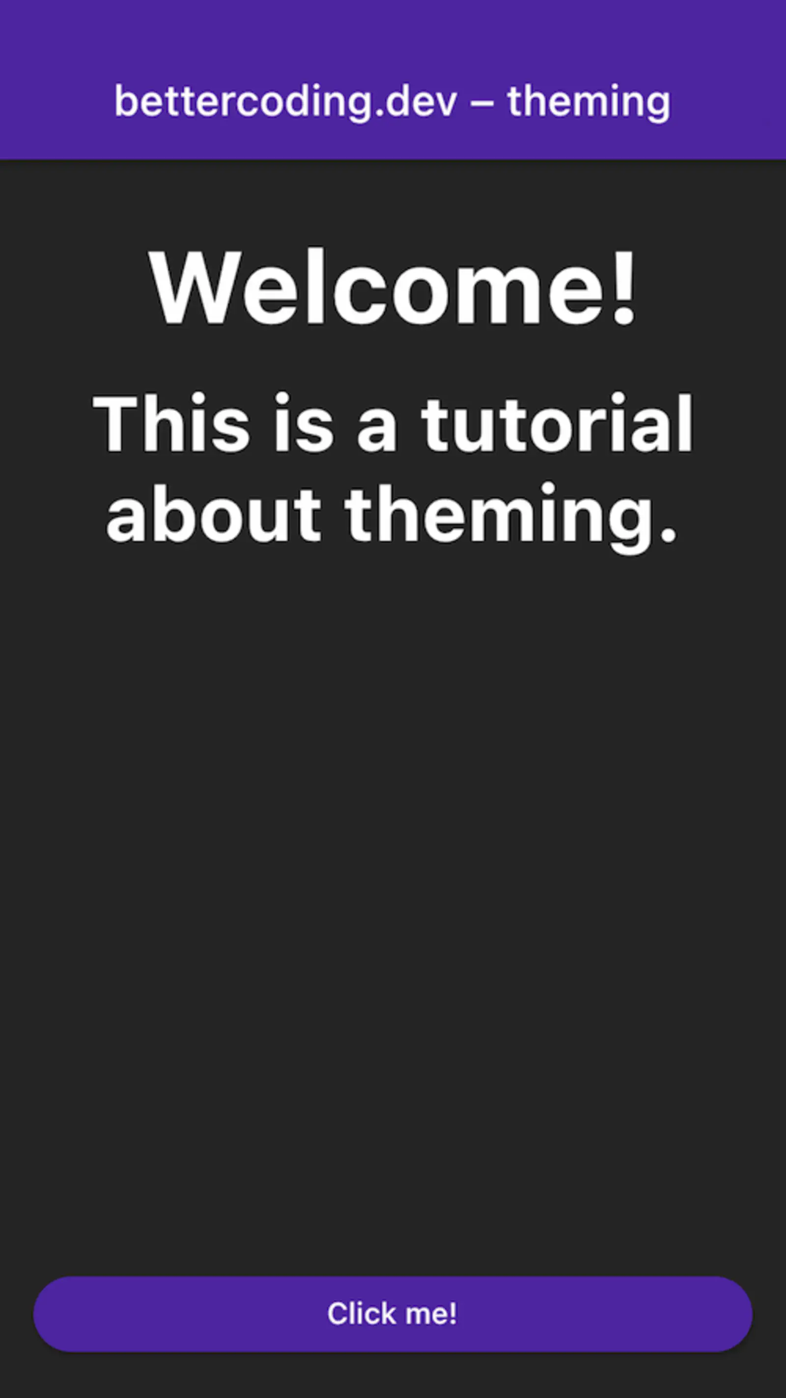
So far, so good. A basic implementation of the app is ready. But there is more.
Theme-specific Assets: Different images for light and dark mode
Very often, it is necessary to use different versions of an image when working with themes. As with the text color, the color of an image in dark theme needs to change.
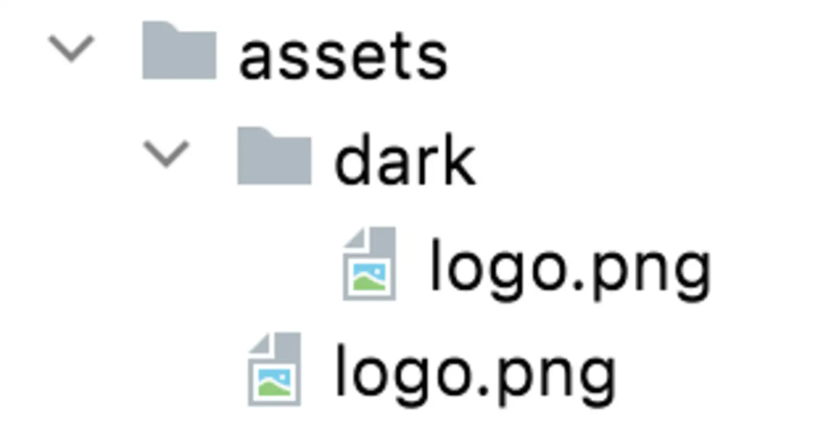
In the assets folder, upload an image that you want to use for light mode and call it logo.png. Create a subfolder
called dark and upload the dark mode version of the image with the same name.
The folder structure should look like this:
In theme.dart, we add a function imageForName to the CustomTheme extension.
| |
The function checks the current brightness and builds the path to the asset accordingly. Let’s use this function to add
an image to the MainPage.
Add the following lines between Spacer and ElevatedButton:
| |
Don’t forget to import your theme.dart file, so your extension functions can be used.
Here we make use of two extension functions we built earlier. imageForName loads a theme-specific image from the
assets. Just pass the correct name of the file and the function resolves the correct asset for you.
custom.imageSize lets us access a theme-specific attribute that we defined earlier.
Let’s build the app again and see what we have got.
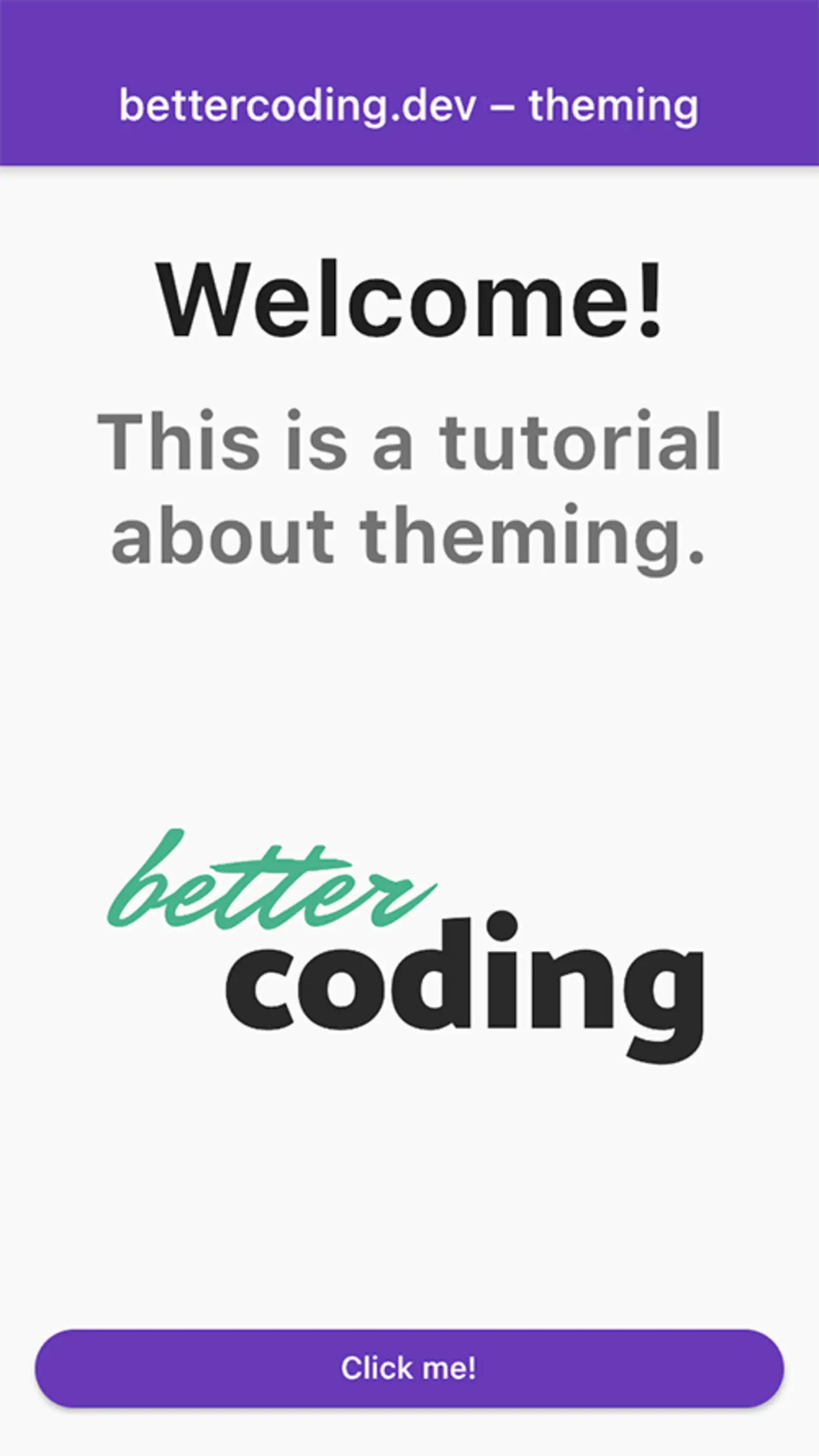
We see that our app shows different images and adjusts the size according to what we have specified in our
CustomThemeData.
Theme Switching: changing the Theme within the App
Finally, we are going to implement the functionality to switch between light and dark mode by clicking a button. For
this, we create a new StateProvider in theme.dart, just below the other providers.
final themeMode = StateProvider((ref) => ThemeMode.light);
A StateProvider is a provider that holds a changeable state. We initialize this state with ThemeMode.light. This
means, by default, our app will always open in light mode. This might not be ideal, but we’ll have a look at
alternatives in “Persisting the current Theme”.
Next, we go to main.dart and set the themeMode of our MaterialApp widget. The widget should now look like this:
| |
And finally, let’s implement the onPressed callback of our ElevatedButton in main_page.dart.
| |
The context.read function – don’t forget to import the Riverpod library! – allows us to access the StateProvider.
First, we read the state to see which mode is currently active. Then we assign a new value to the state – dark mode if
we are currently in light mode and vice versa.
Setting the state causes all widgets that are watching the themeMode StateProvider to rebuild, using the new value.
In our case, this is the MaterialApp widget.
Clicking the button, switches between light and dark mode.
Voilà! We now can conveniently switch between the different themes from within our app. In a larger app, you would
probably add the logic setting the state of our themeMode StateProvider to your settings page.
Persisting the current Theme
One drawback this solution has is that the selected theme is reset once you restart the app. In order to keep the state over time, it is necessary to persist it at some point. Using shared preferences would be a possible solution.
I have implemented a solution in the persist_theme branch of
the project repository. If you would like me to
add a tutorial on how I did this, let me know by leaving a comment.
Finally
In this tutorial, we saw how light and dark mode can be implemented in Flutter using Riverpod. Additionally, we
created a way to extend ThemeData with custom attributes and how to load theme-specific assets.
Like always, there are certainly other possible solutions as well. If you want me to implement this example using different packages than Riverpod, or if you have any suggestions to my solution, write me a comment below.